Hammer Marketing Wins a 2021 In-House Design Award
How Subdivision Branding Gave Each Business Line Its Own Personality
There’s something about being an in-house designer that can be both rewarding and challenging. It means we have to find ways to introduce creativity and innovation into the workspace, which also means taking risks. Fortunately, Weidenhammer has always been open to new ideas and we had an opportunity to flex our creative muscles in a big way.
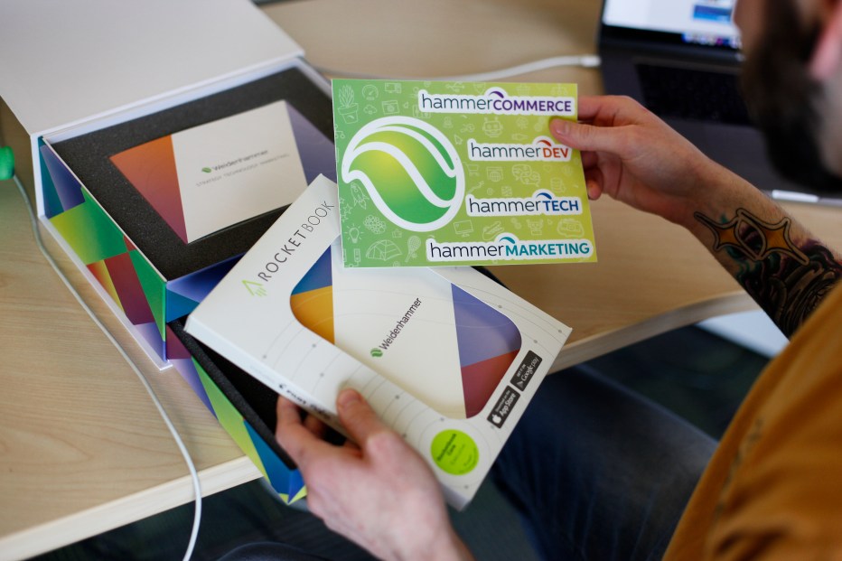
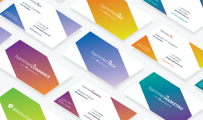
When the decision was made to coalesce our core functions into official divisions — Hammer Commerce, Hammer Dev, Hammer Marketing, and Hammer Tech, there were a number of logistical questions for leadership to consider. However, as the in-house design team, our concern was, “How do we create branding that is cohesive yet distinct to reflect each of the new divisions?”
As my colleague, Kyle Huntzinger put it, “The Weidenhammer brand doesn’t really invoke an idea of what the breadth of the company can do. So when we have these sub-brands, we can tell clients in the name and text of the logo what we do.”
We put our thinking hats on and got to work.
The Design Process
We knew we needed something that would immediately harken back to Weidenhammer’s visual identity. The round orb that has been part of Weidenhammer’s logo gave us some ideas to play with. While several concepts were brought forward, ultimately, we landed on using the negative space in the bottom of the current logo, which creates a kinetic shape. That shape can slot into the Weidenhammer orb to represent each division’s role within the larger organization, while also harkening back to the Weidenhammer parent brand through a visually simplified head of a hammer.

Now that we had a logo, we needed to consider the other components of each division’s visual identity: colors, creative design, and imagery. The use of light to heavier weighted fonts from the abbreviated parent name into the division is meant to be pleasant, light, and modern, reflecting each division’s place in our current digital landscape. As for the divisional color palettes, we wanted something that took reference from the parent brand but had its own distinctive flavor. A viewer should be able to put them side-by-side and realize they were all connected without being told. And from there, we could focus on color development and brand guidelines.
The Winner Is…
Once each division’s visual identity was underway, we wanted to acknowledge our accomplishments. In our industry, Graphic Design USA (GDUSA) is a pretty big deal, as are their Inhouse Design Awards. They seemed like the perfect opportunity to showcase our work. We were one of more than 6800 submissions — of which around 350 were chosen as winners — including us! Hammer Marketing won a 2021 Divisional Branding Expansion GDUSA Award.
Our institutional understanding of Weidenhammer and each of the division’s roles meant that we could adeptly convey that through the visual identity and rebrand, and it was an honor to have that acknowledged by our community of peers. However, just because we won in 2021 doesn’t mean we won’t keep striving for future wins!

